Suma Wellness Center
An early project named ‘365 Days To A Better You’ was an abstracted way to communicate an idea through a calendar year. It focused on the process of learning yoga and the idea of the body and mind coming together to create a balanced lifestyle. Instead of redesigning the calendar, I took the yoga/wellness concept and created a brand for a wellness and yoga center called ‘Suma.’
The name ‘Suma’ is derived from an herbal medicine found in different regions of the world. Additionally, suma is called para toda, or "for all things" and reflects my concept for this total body/mind wellness center. It is used in many cultures for natural healing of general illness and strengthening of the bodily systems.
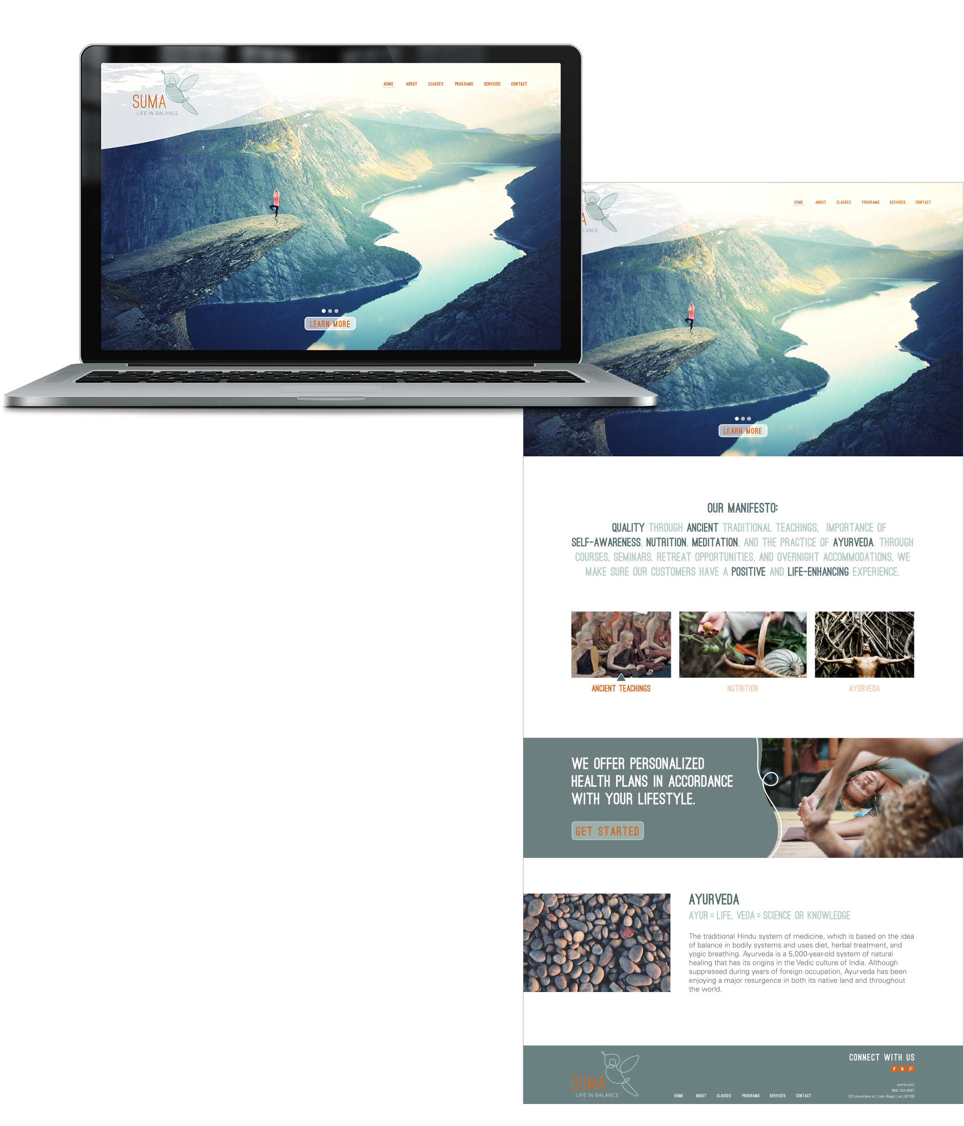
The idea behind ‘Suma’ was to create an environment where everyday people could increase their total wellbeing through ancient traditions focusing on the importance of self-awareness, nutrition, meditation, and Ayurveda (the traditional Hindu system of medicine, which is based on the idea of balance in bodily systems and uses diet, herbal treatment, and yogic breathing). With courses, seminars, retreat opportunities, and overnight accommodations, Suma strives to provide a positive and life enhancing experience. The target audience was everyday individuals seeking a healthier lifestyle through natural remedies and in the age range of thirty and older.
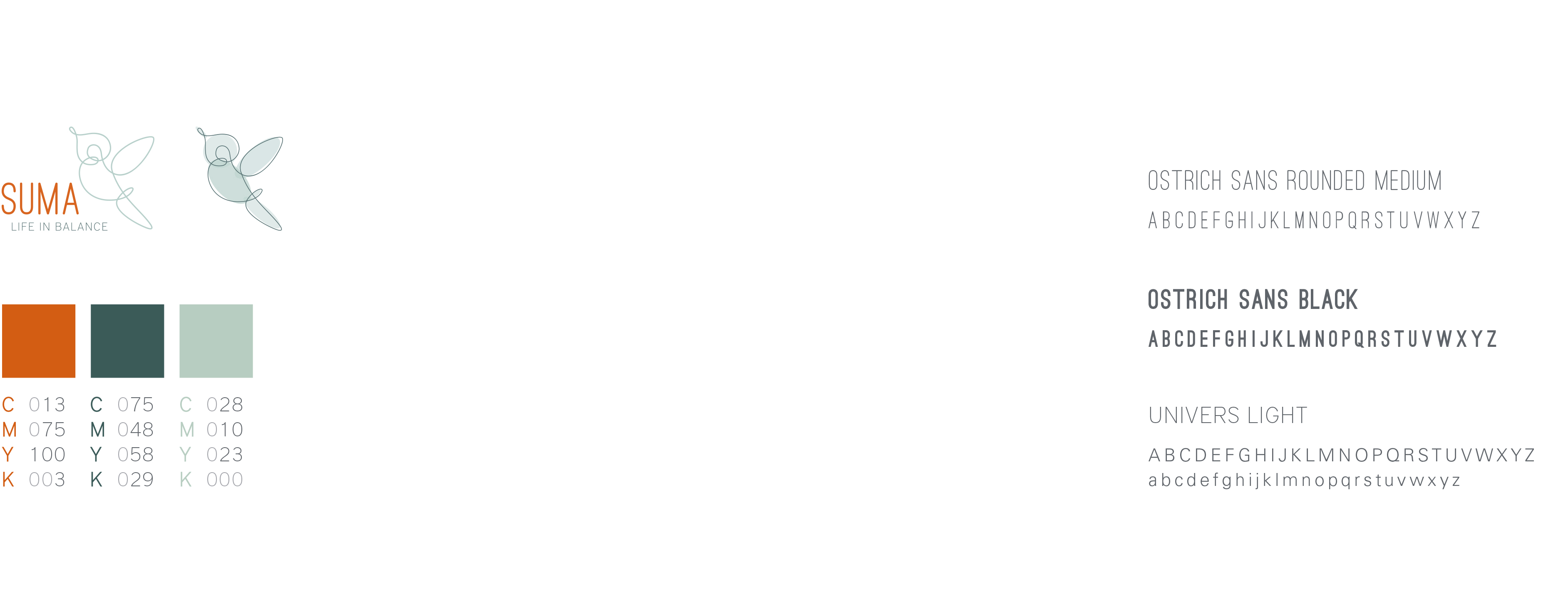
Based on the mission of the brand and company, the logo was designed with an inviting, openhearted, and calming feel. The transparencies used in the mark in addition with the fluid line, give the brand a happy, joyous, and light feeling, as represented by the hummingbird. The color choices for the brand also work to reinforce these brand attributes throughout the deliverables.
The name ‘Suma’ is derived from an herbal medicine found throughout the world today. Additionally, suma is called para toda, or "for all things" which is why I thought it was the perfect name for a total body/mind wellness center. It is used in many cultures for natural healing of general illness and strengthening of the bodily systems.
The idea behind ‘Suma’ was to create an environment where everyday people could increase their total wellbeing through ancient traditions focusing on the importance of self-awareness, nutrition, meditation, and Ayurveda (the traditional Hindu system of medicine, which is based on the idea of balance in bodily systems and uses diet, herbal treatment, and yogic breathing). With courses, seminars, retreat opportunities, and overnight accommodations, Suma could make sure their customers had a positive and life enhancing experience. The target audience was everyday individuals seeking a healthier lifestyle through natural remedies and ranging in age from 30-elderly.
Based on the mission of the brand and company, the logo was designed with an inviting, openhearted, and calming feel. The transparencies used in the mark in addition with the fluid line, give the brand a happy, joyous, and light feeling which is what the hummingbird itself represents. The color choices for the brand also work to reinforce these brand attributes throughout the deliverables.