Few & Far Between
This was a project I had been interested in developing for a long time. After studying abroad in Florence, Italy and taking a wine-tasting class, I had a new and expanding interest in wine. I was lucky enough to have time to finally design a complete vineyard brand, located in Napa Valley, California.
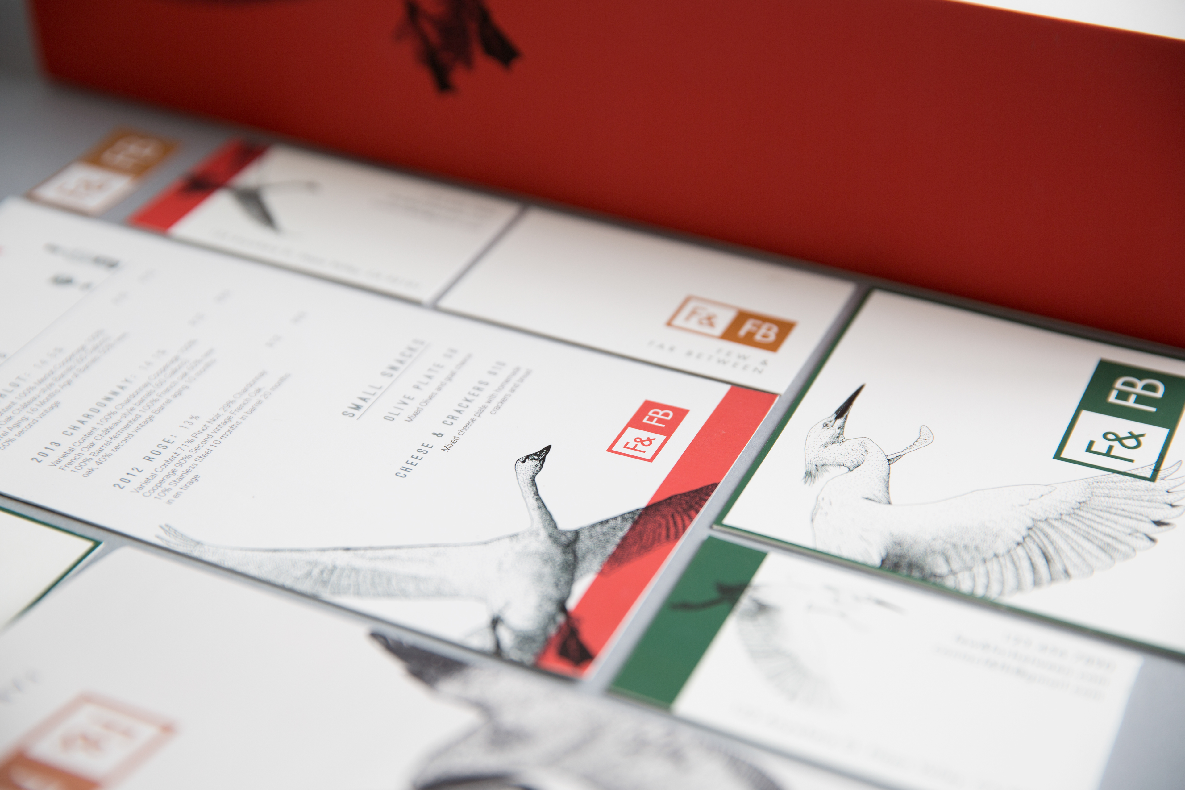
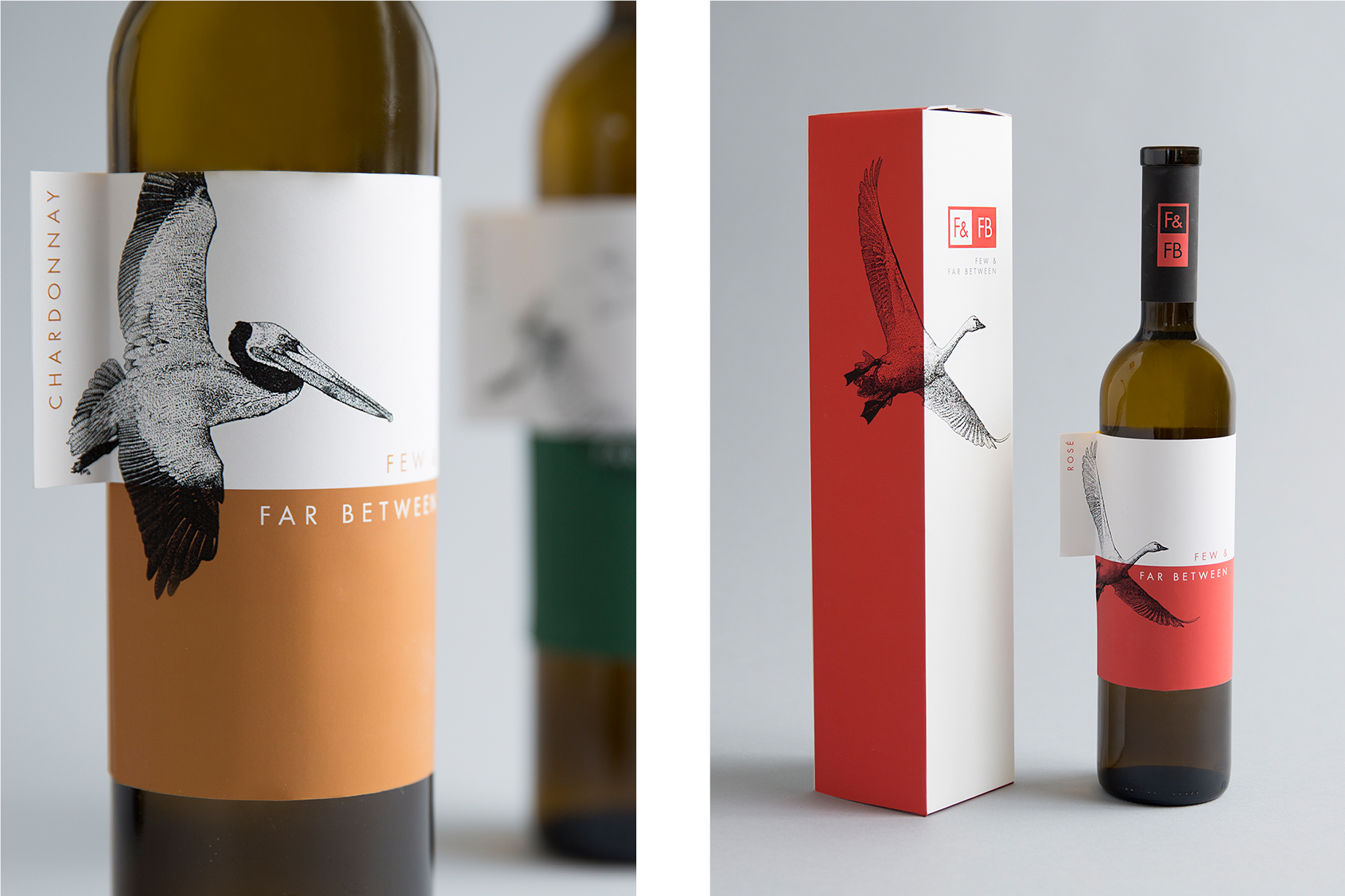
The idea for this brand came after extensive research about the area. I knew I wanted black and white illustrations to be a part of the system, but I was unsure what role they would play. When I was researching, I came across an interesting article written by a woman with her own winery in Napa Valley about all of the rare species she had seen in her vineyards over the years.
My mind started racing when I read this, and if the wine label could be based on the concept of a ‘rare species,’ reflecting the idea of the specialty vineyard. I looked up synonyms and researched more about what it meant to be ‘rare’ and came up with the name ‘Few & Far Between.’ I wanted the brand to be earthy but modern, which is where the color palette was derived. The red, orange, and green reflect the colors found in the vineyards and in the surrounding areas. From there, I used the rare birds found in the vineyards of Napa Valley as my illustrations to tie the whole brand together.